

BRAND STRATEGY | BRAND IDENTITY | VERBAL IDENTITY | CREATIVE DIRECTION | DIGITALThe wïsh centre
OVERVIEWThe wïsh centre is a London based charity that prevents self harm and the abuse of children and young people aged 12-25 years. It wanted to build on the work it was doing in London and grow it into a UK wide network. The wïsh centre has passionate, heart warming and truly amazing people at its core.
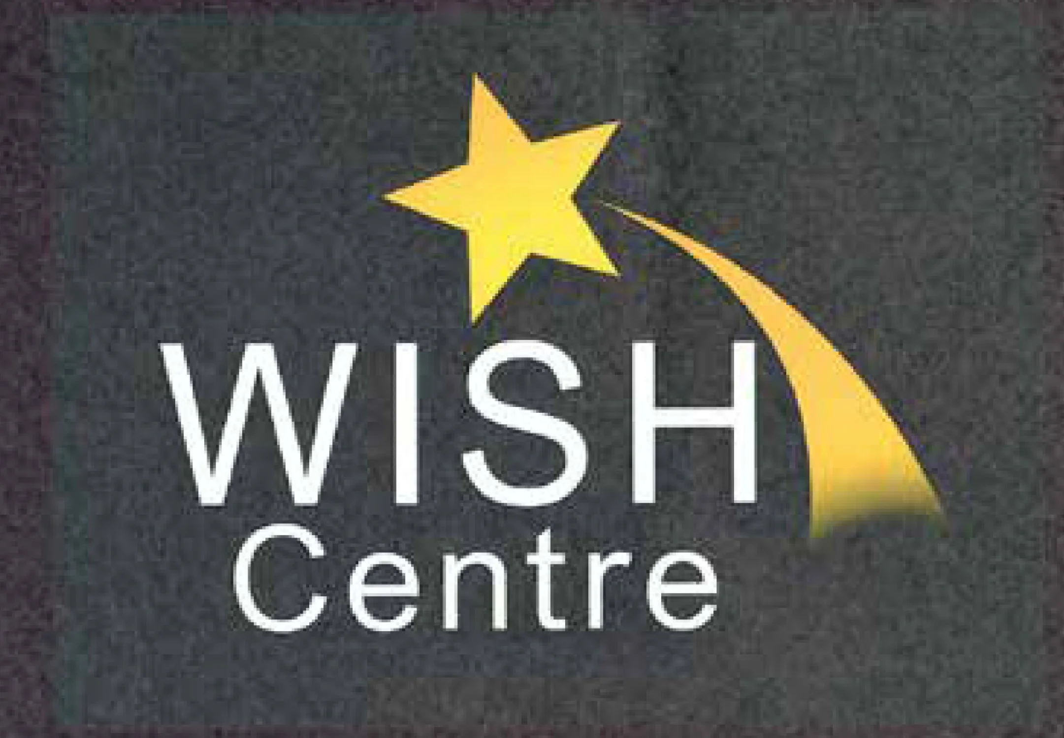
BEFORE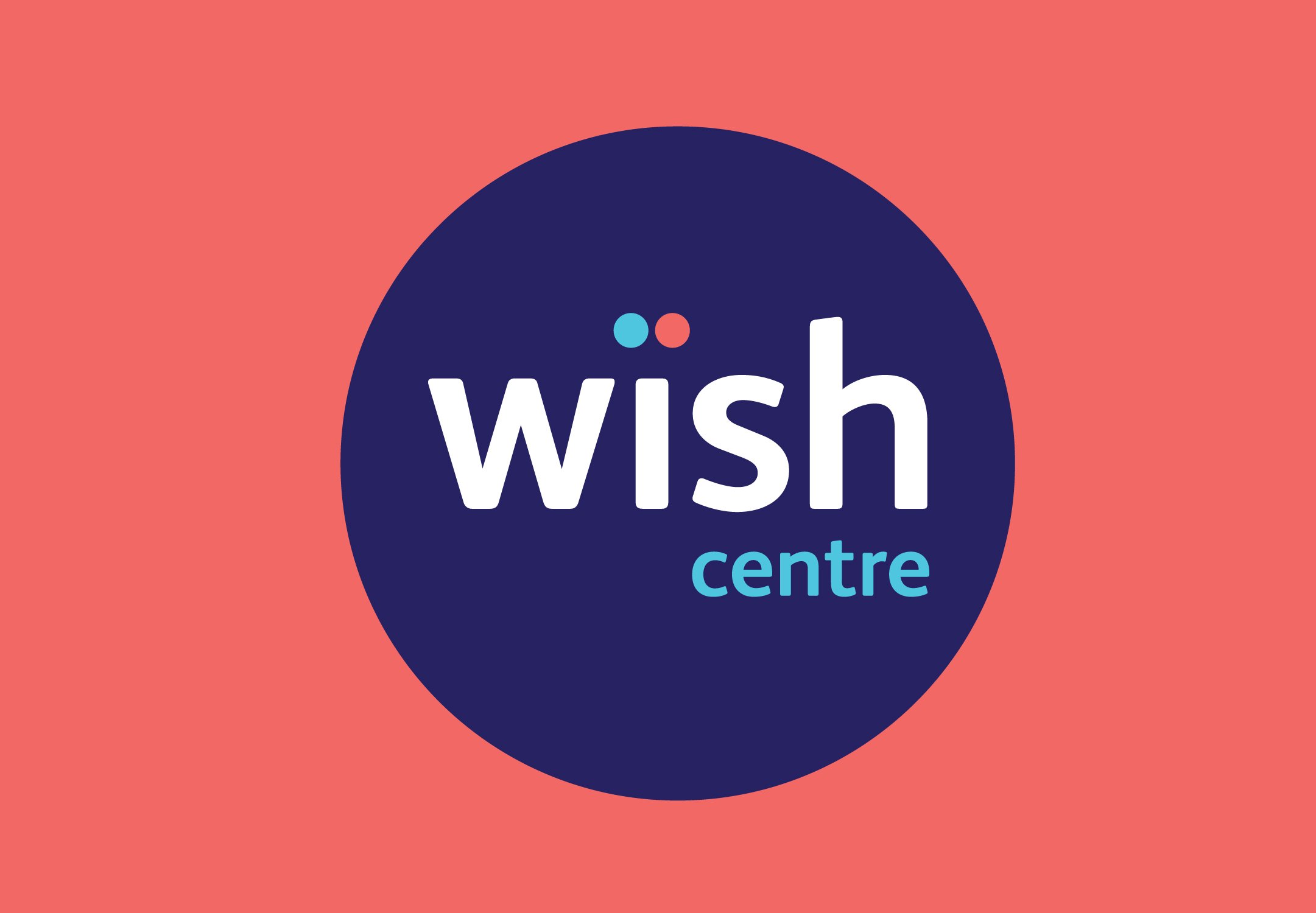
AFTERThe issue was that The wïsh centre’s brand language portrayed a very negative picture of them. Whilst it showed empathy using discrete pictures of clients which were relatable, it did no favours in helping communicate the positive and forward thinking organisation they are.
The challenge was to create a brand system which can engage with both Health Care Professionals and young people who self harm, at the same time.
THE PROBLEMTHE SOLUTIONWhilst still showing empathy and of course sensitivity, their new story starts at the end. A version based on positive outcomes.
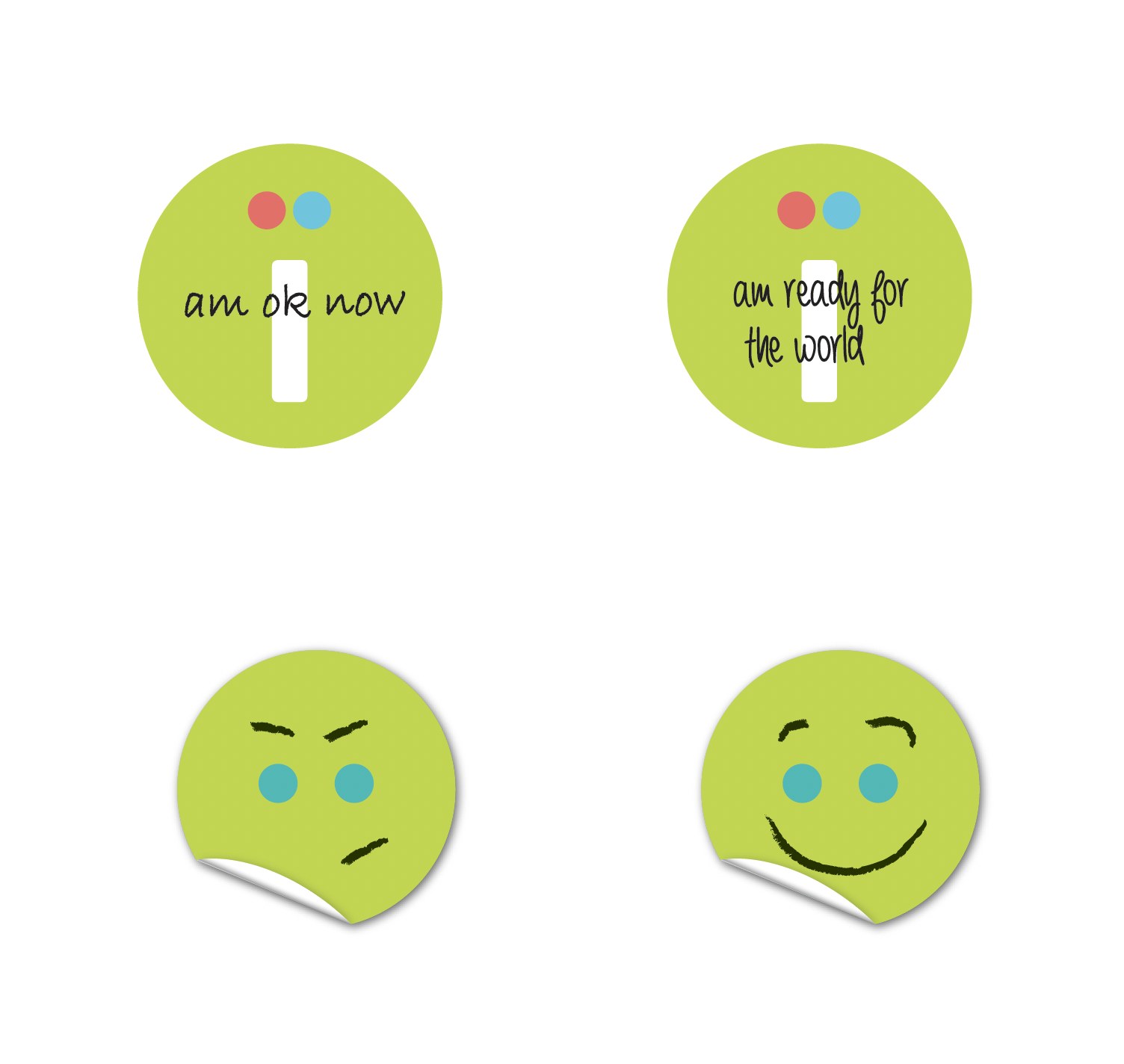
As the old saying goes, ‘a problem shared is a problem halved’. This was core to the new brand promise – two people instead of just one. And so instead of just one dot over the ‘i’ in the name, another one was added forming an umlaut. The new positioning statement became ‘Effective Together’.
The umlaut is the key visual brand component, with messaging and imagery able to change according to audience.
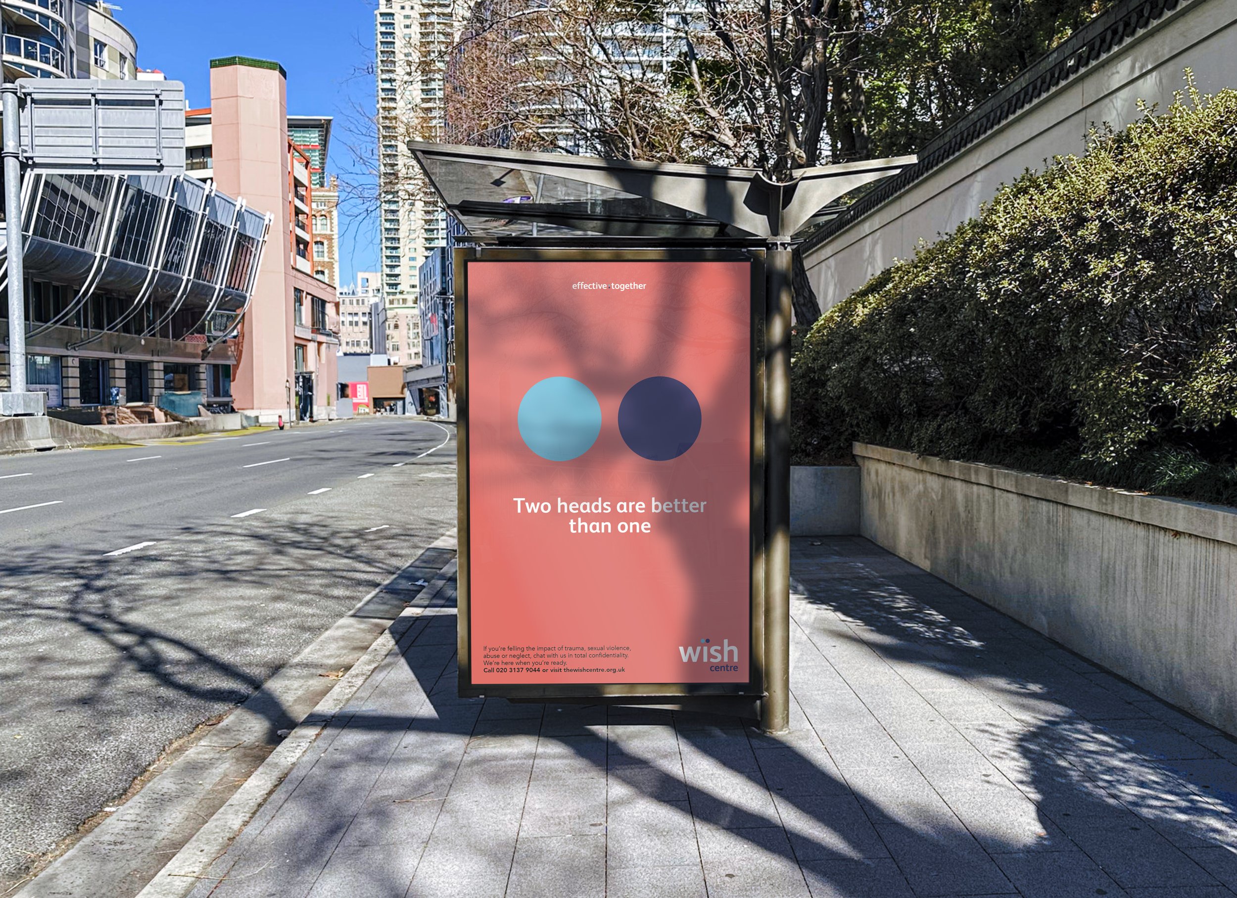

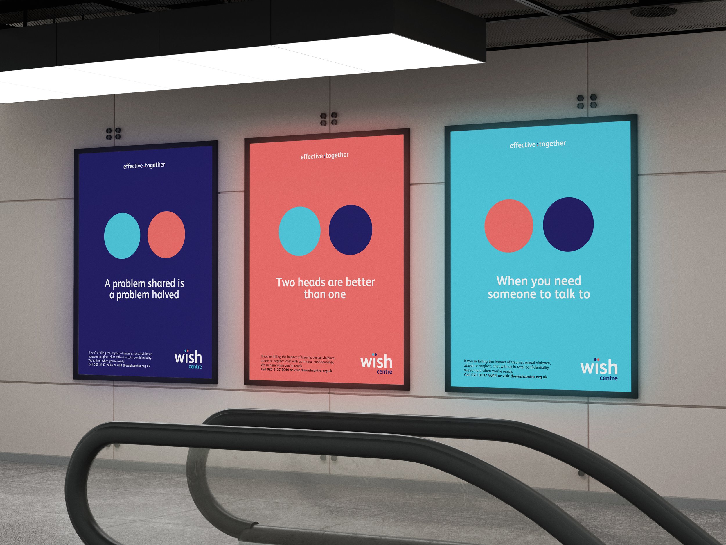
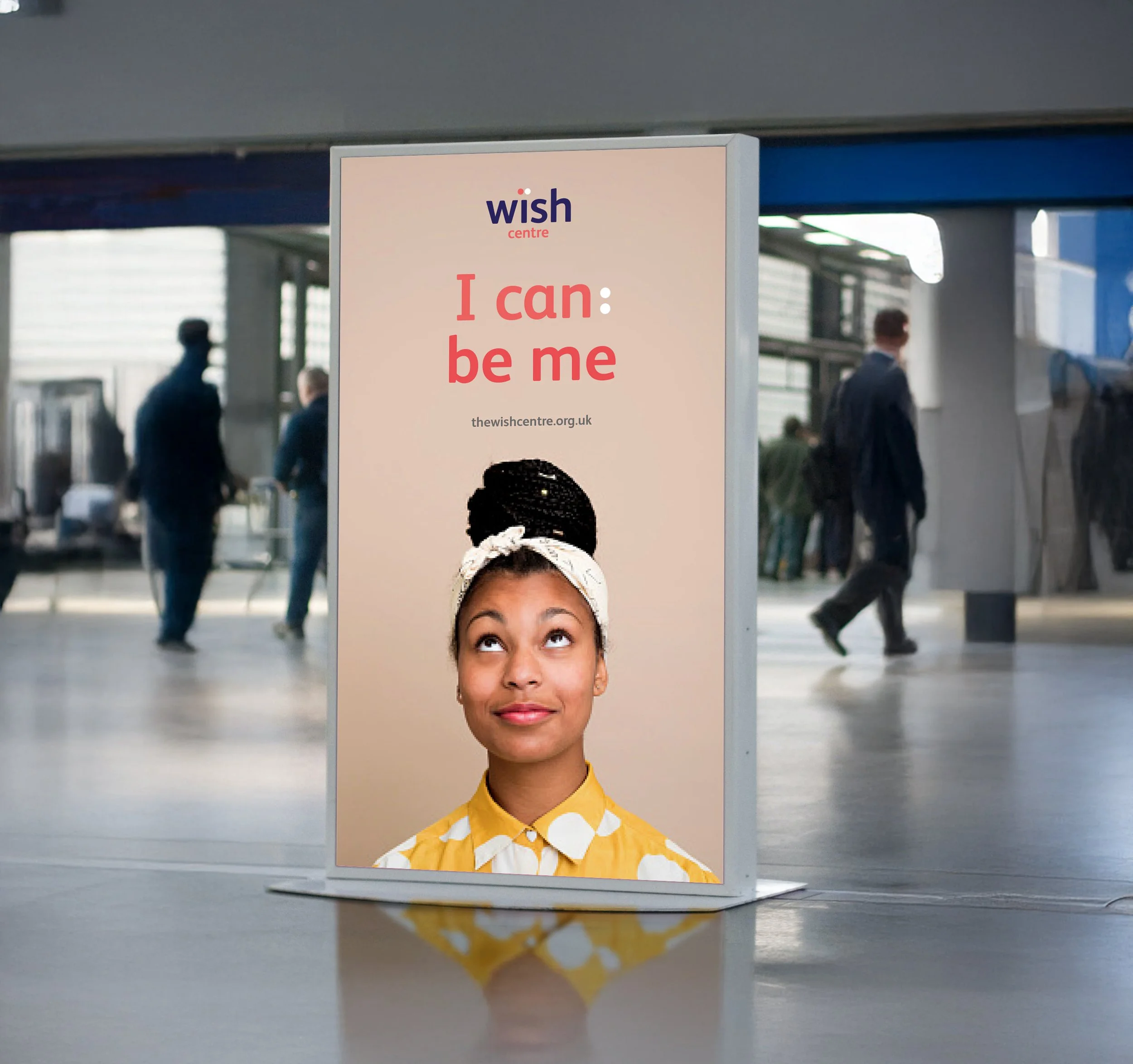
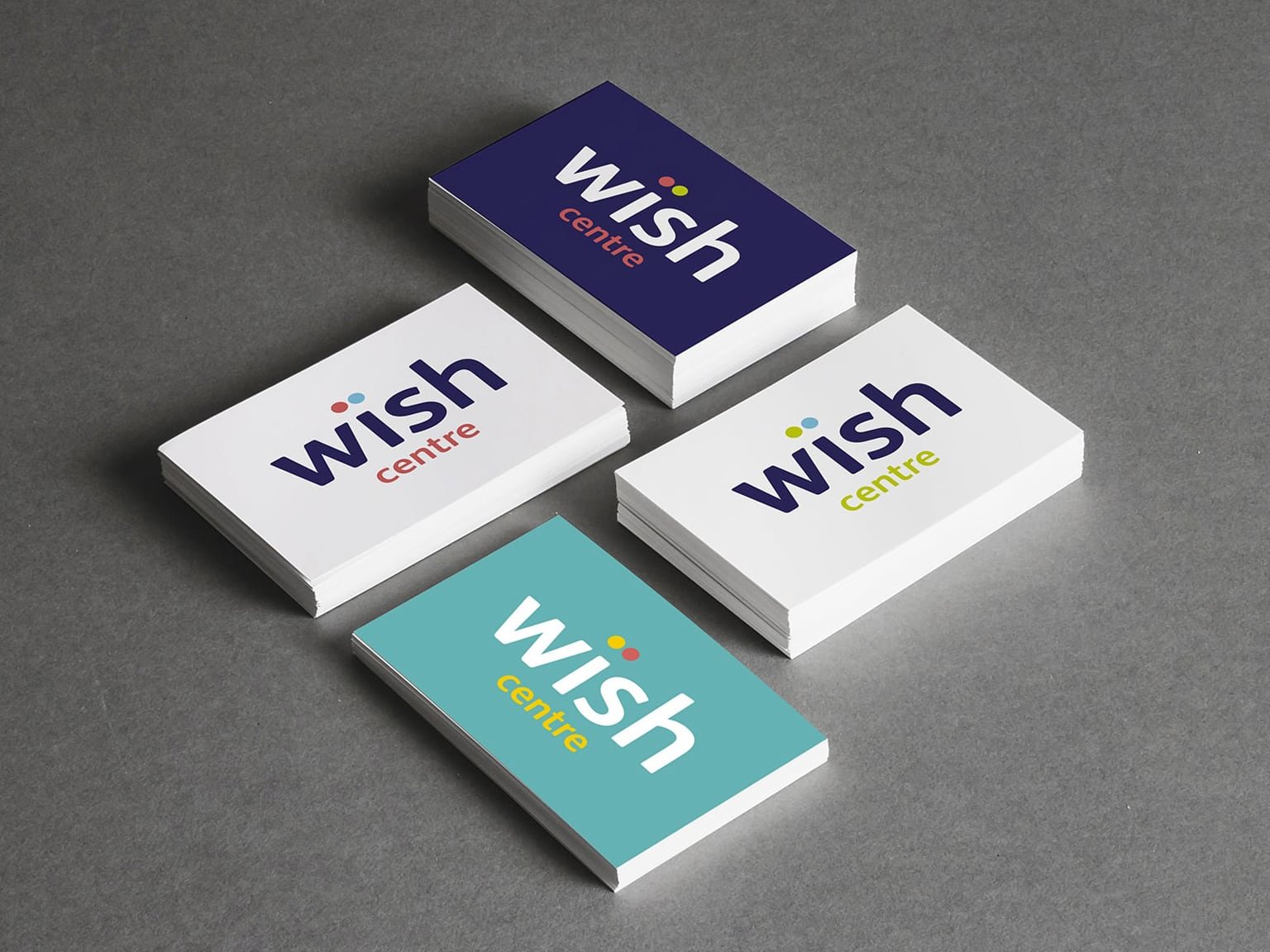
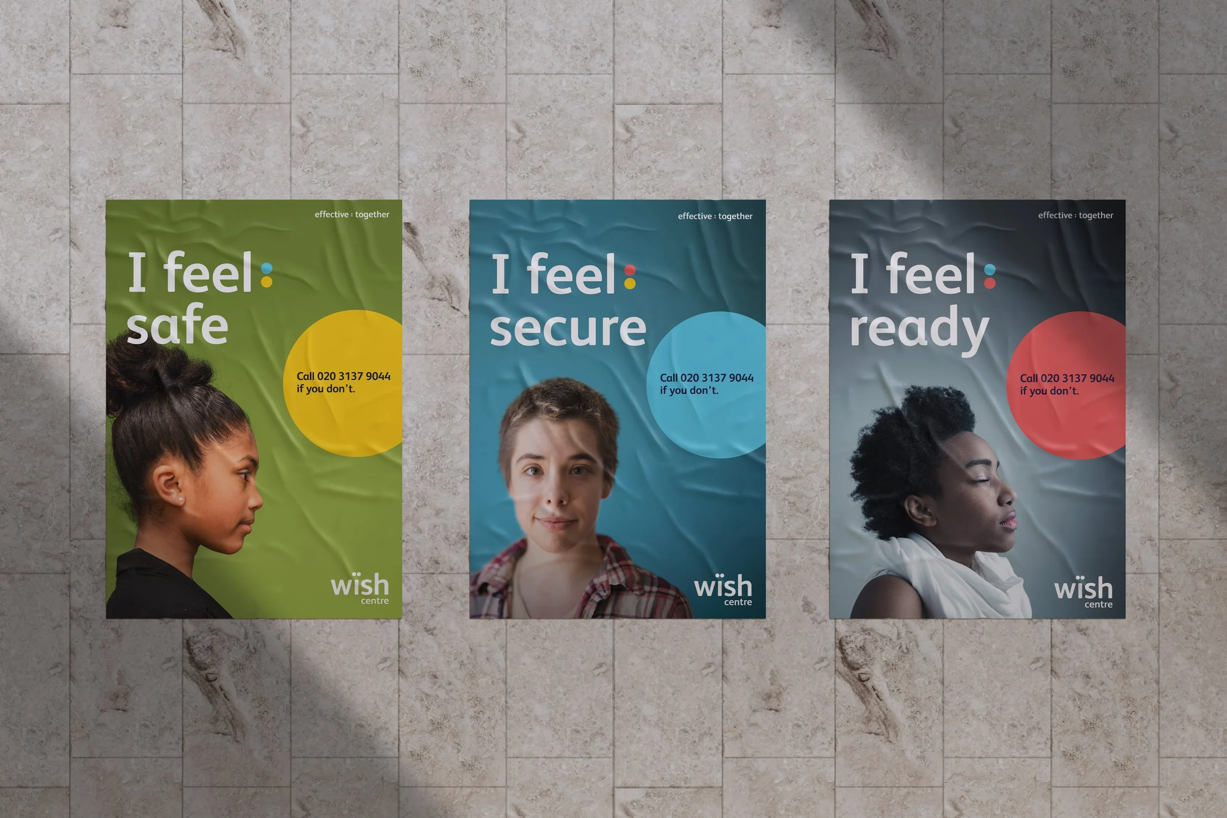
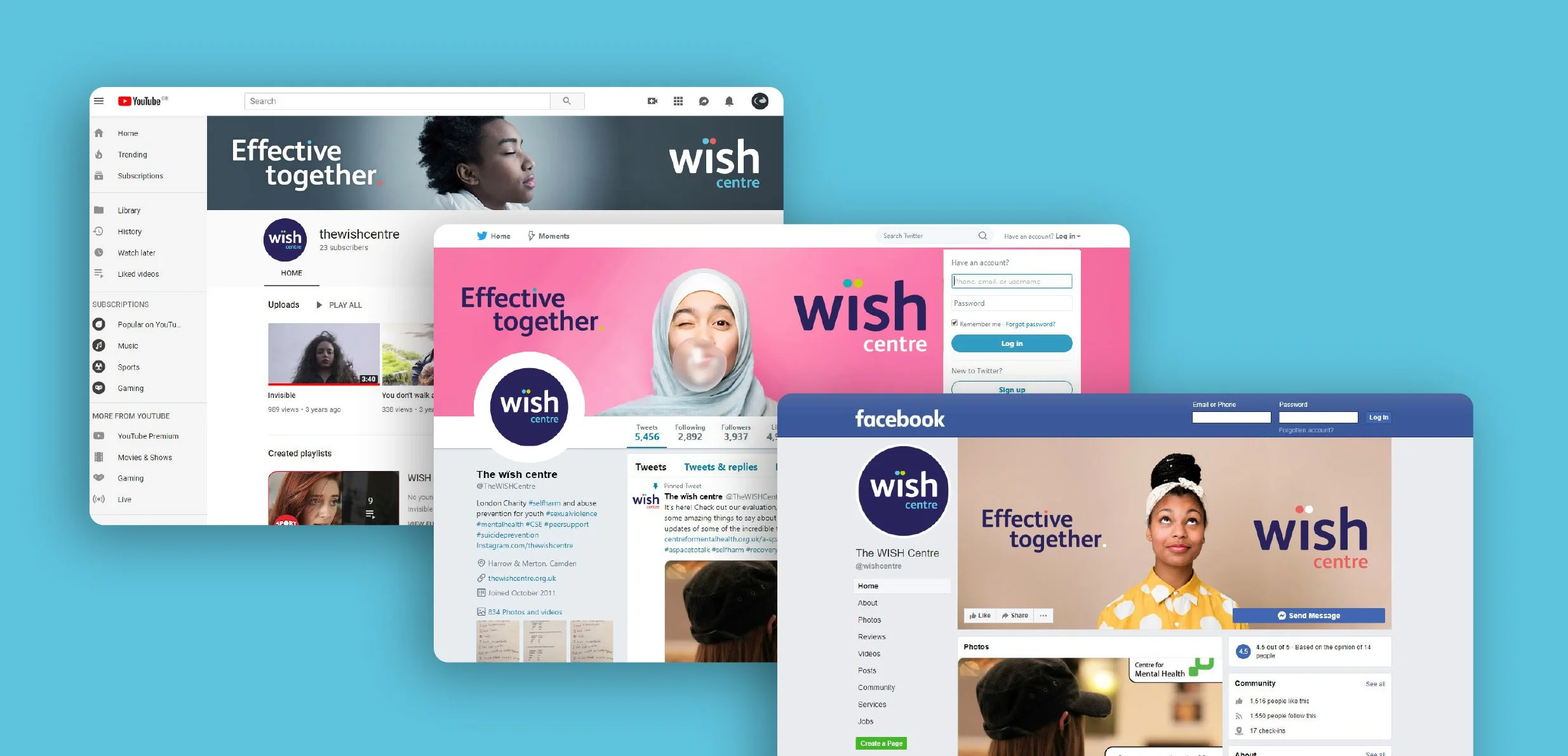
The rebrand has given The wïsh centre a clearer, more compelling identity that better reflects its mission and values. Through a refreshed visual identity and messaging, we strengthened recognition, improved audience engagement, increased credibility with supporters and partners, and created a flexible brand platform to support future fundraising and growth.
THE RESULTSMY ROLEEvery rebrand is important but this one and probably to do with the nature of what they do, really grabbed me. I led The wïsh centre’s brand transformation, turning it from a slightly negative experience into a much more positive one with a stronger visual identity and clearer messaging that increased audience engagement and improved brand recognition at every touchpoint.
Created at Courts
Creative Director: Mike Abbott
Head of Digital: Matt Daly
Head of Motion: Rich Ginders
Account Director: Ross Williams