

BRAND STRATEGY | BRAND IDENTITY | VERBAL IDENTITY | CREATIVE DIRECTION | DIGITALXTM
OVERVIEWGlobal SaaS company, XTM brings translation management, software localisation, business management, and video creation together onto one platform; helping global organisations manage translation at scale. Its AI-powered platform streamlines localisation, improves quality, and reduces translation costs.
A generic looking brand language including tired typography, cheap stock shots and a washed out pastel colour palette really undersold the brand, blending into the competition and positioning XTM in the wrong light; not reflecting XTM’s purpose as the leader it is in global translation.
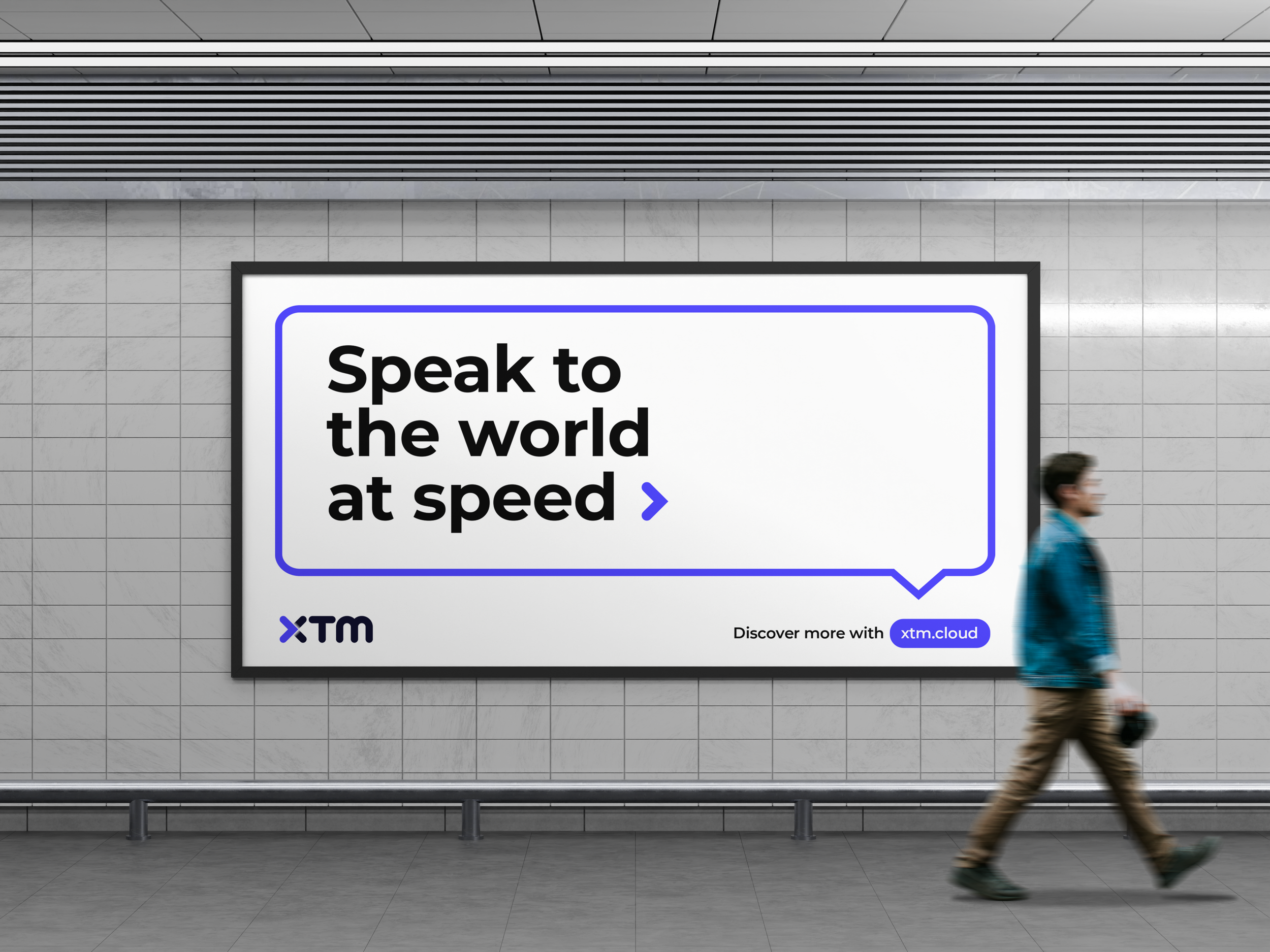
THE PROBLEMTHE SOLUTIONThe solution involved tightening the identity and then really opening up a whole new brand system with language at its core. A new colour palette and typography were introduced and then an evolution was put in place which gave XTM a much more comprehensive set of brand assets to work with including new GUIs and solution iconography.
The visual language was pushed in more powerful directions giving XTM the tools it needed to reposition and stand out from the competition.
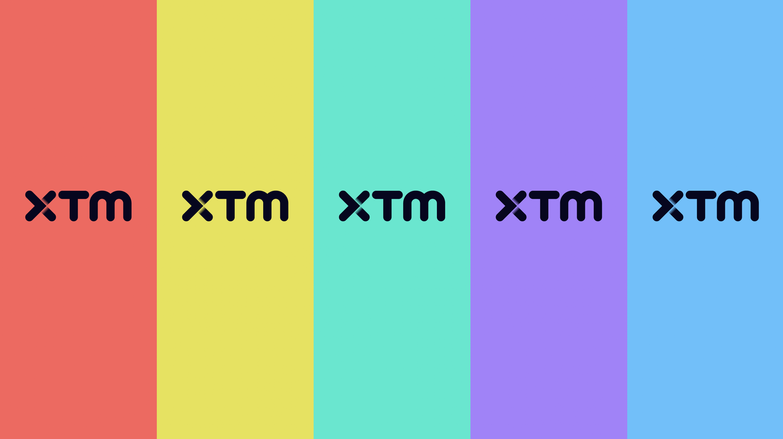
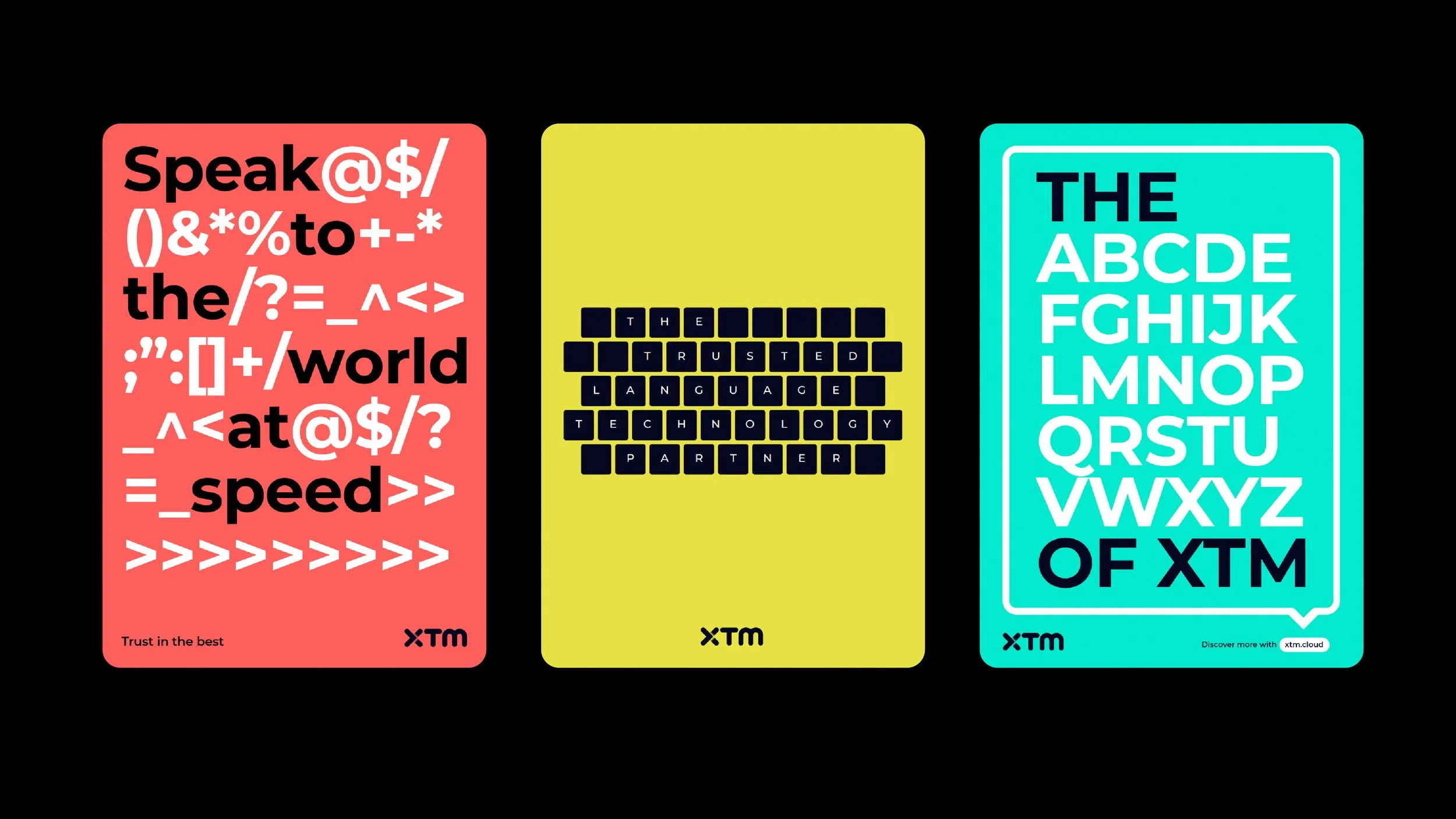
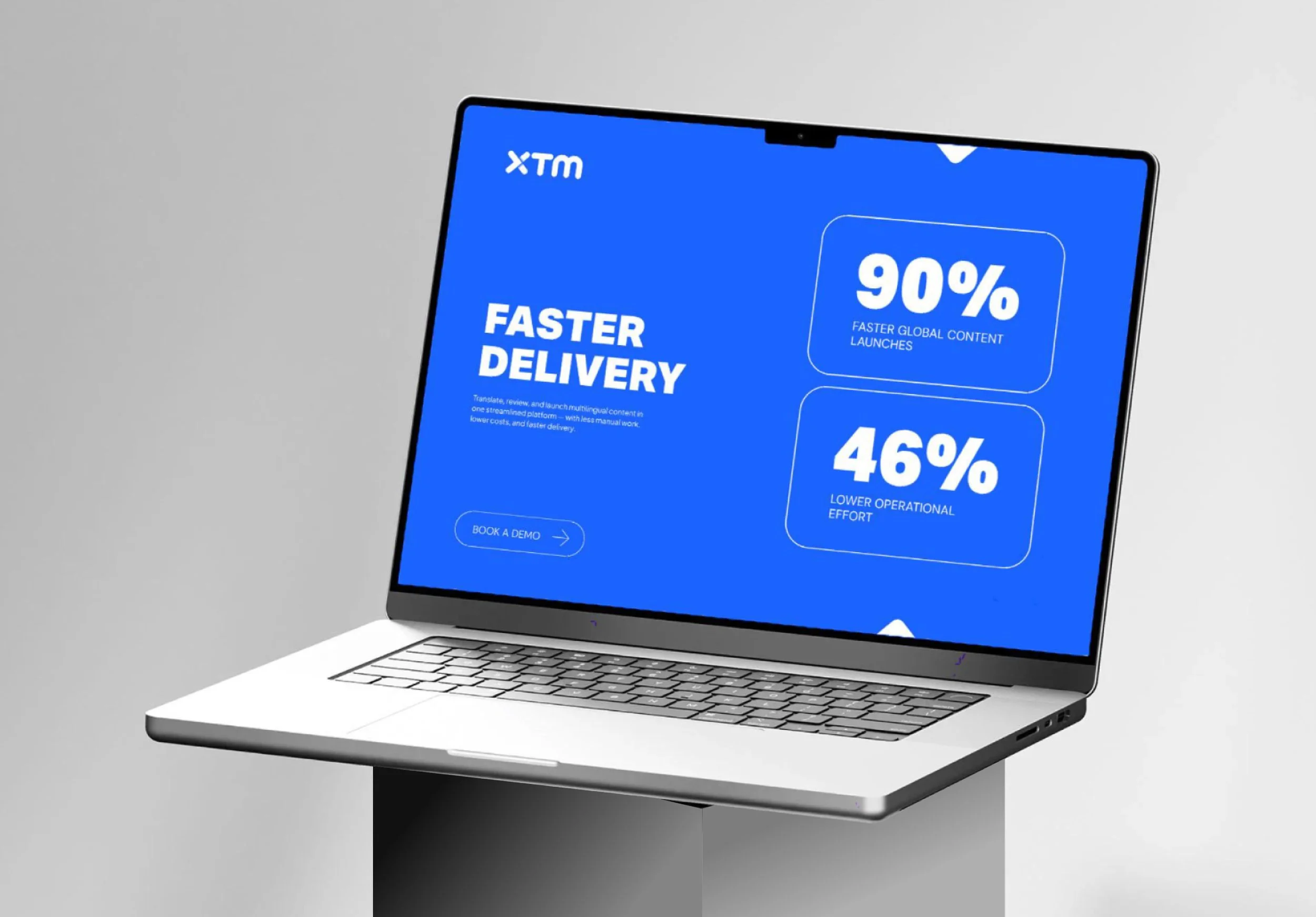
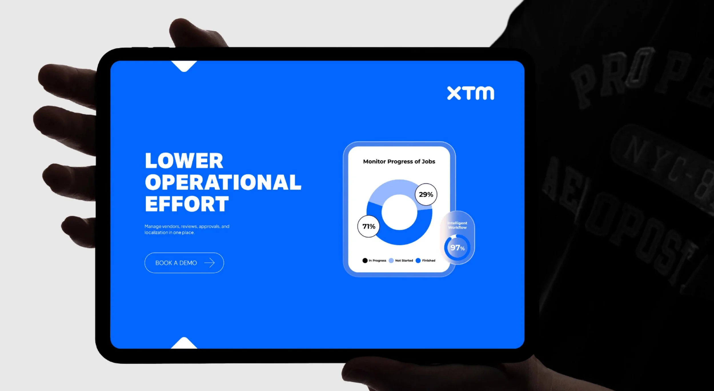
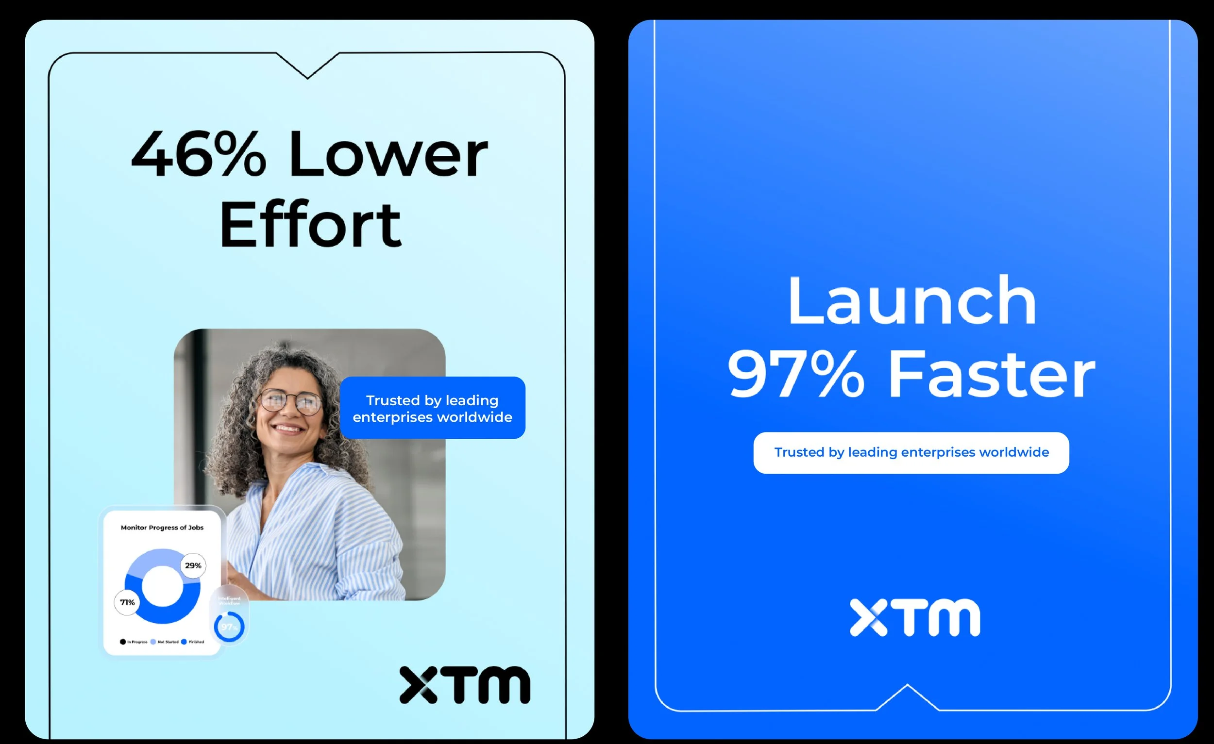
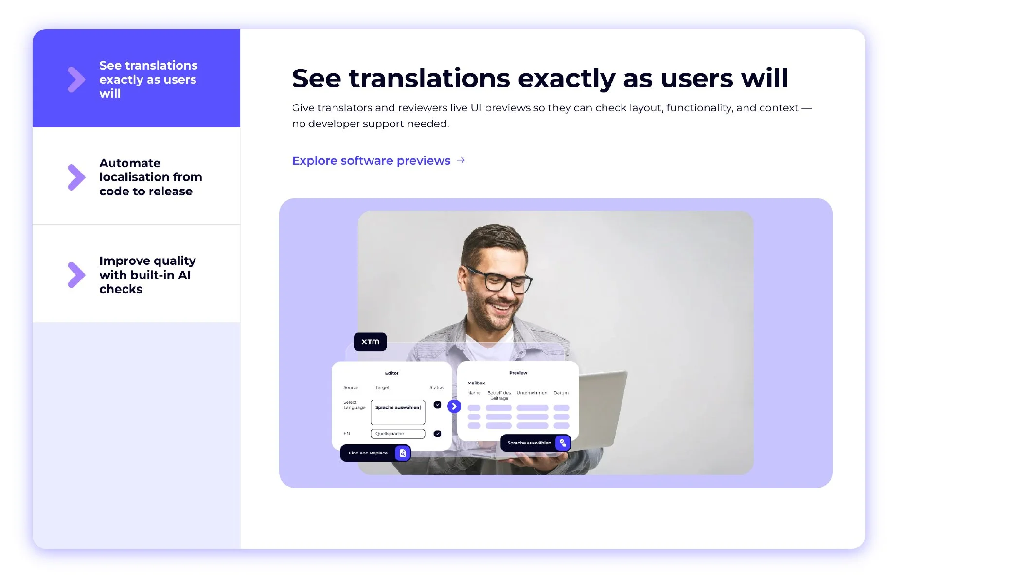
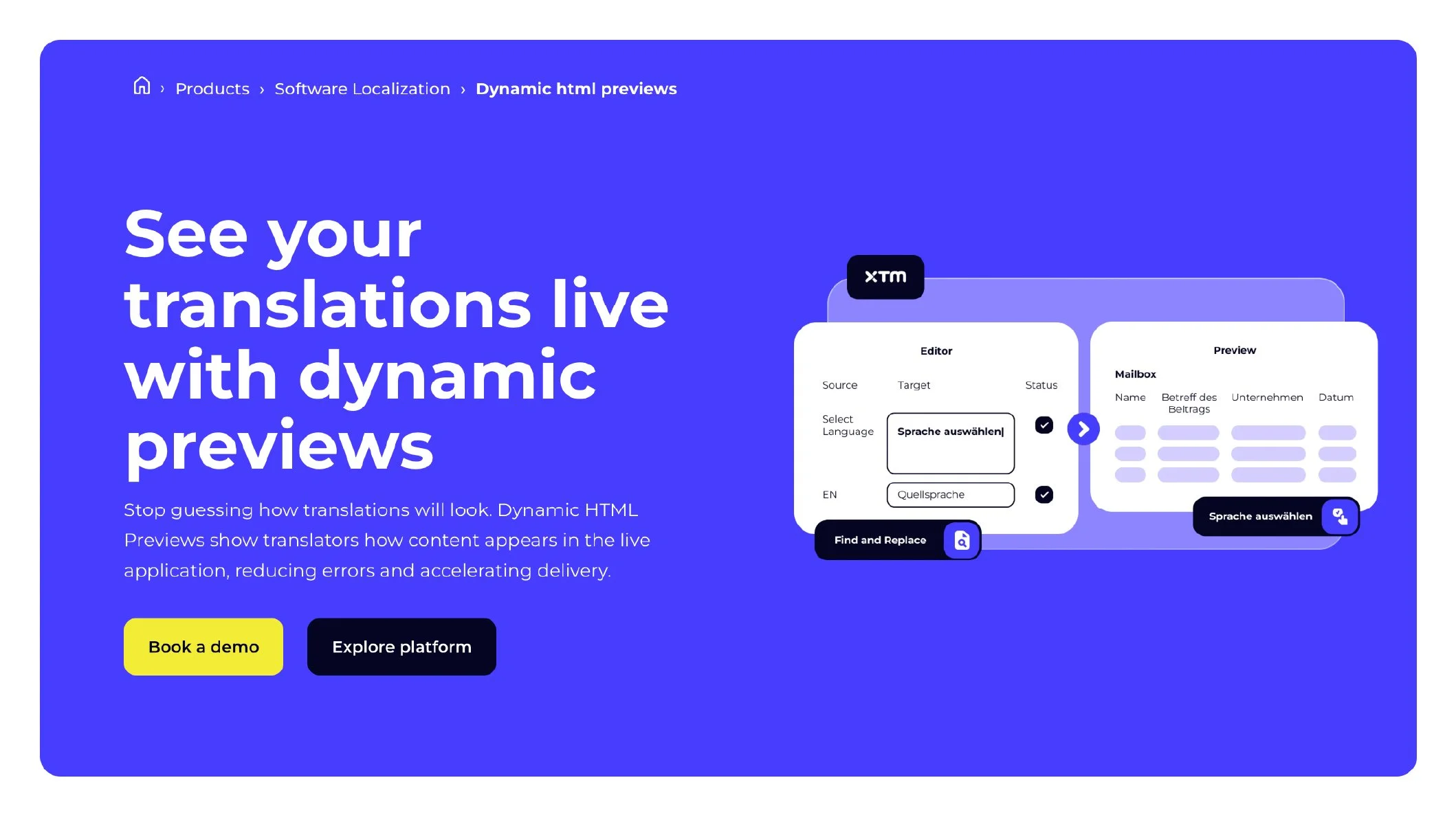
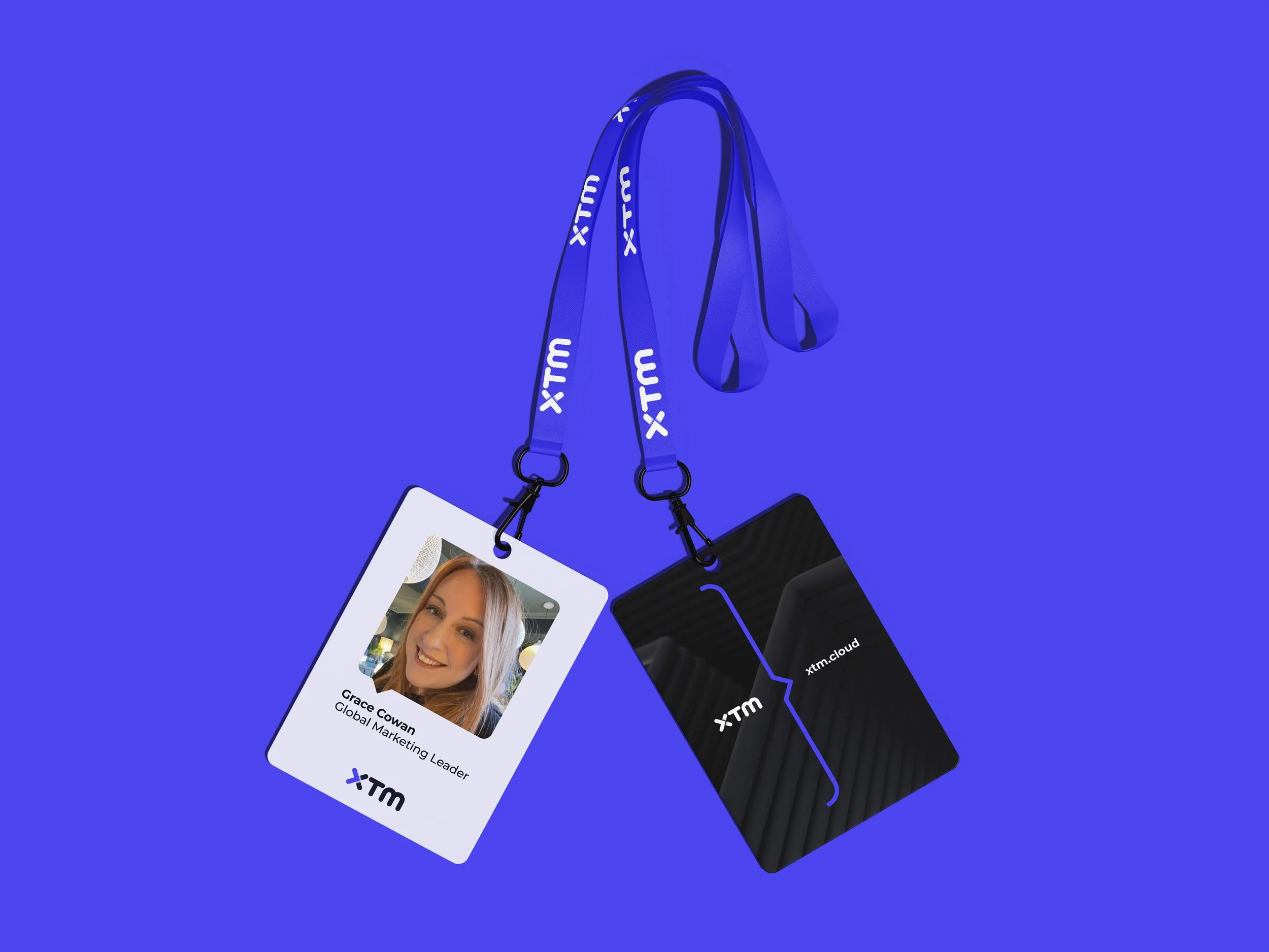

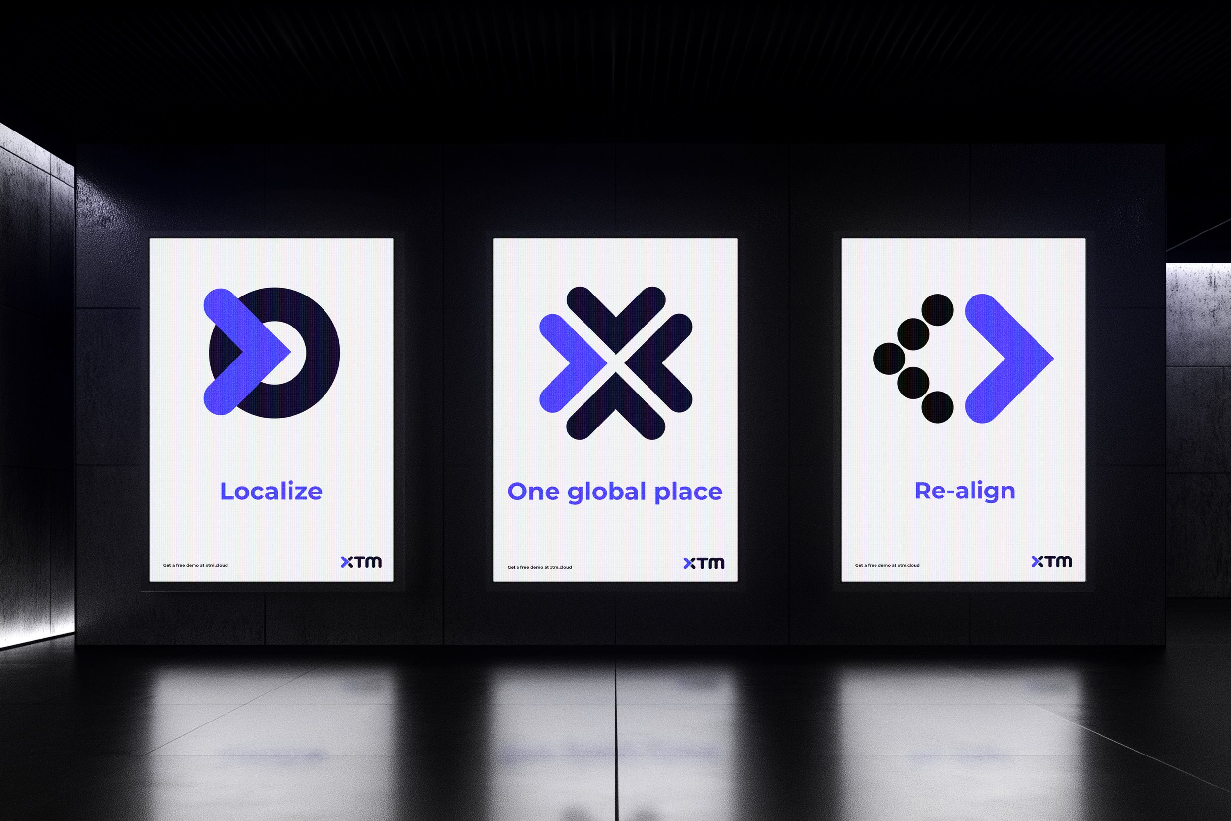
The rebrand positioned XTM as a modern, trusted language partner with a distinctive identity. We clarified its value proposition, strengthened brand consistency across international markets, enhanced customer confidence, and created a scalable platform to support growth, innovation, and global expansion.
THE RESULTSMY ROLEI led the reposition of the XTM brand through a refined visual identity, strategic messaging and a unified brand system. The transformation strengthened international market presence, increased client confidence, improved brand consistency across regions, and supported new business growth.
Created at Courts
Creative Director: Mike Abbott
Creative Lead: Elis Elmasllari
Motion Designer: Tristan Prior
Head of Digital: Matt Daly
Account Director: Ross Williams